Building a reusable design system to replace repetitive production work and connecting it directly to the codebase.
Role:
Lead UX Designer
Scope
Design system architecture, component library, developer handoff, real-world implementation
When I joined BSO Digital, there was no shared design foundation. The senior designer was working in Photoshop. I'd spent my first year using Adobe XD. Every project started from zero.
In a web agency, time is money and there aren't many attempts at getting things right. A typical build runs on a two-week window. Clients rarely arrive with brand documentation or customer insights and when they do, it rarely extends to anything useful for a developer. Each project meant rebuilding the same atoms, molecules, and organisms from scratch. Colour was a repetitive manual task. Handoff to engineers had no consistent structure. The process was fragile by design.
The question I kept coming back to was simple: how do I stop rebuilding the same things and start reusing them?
Moving from Adobe XD to Figma opened a different kind of thinking. I started researching how established teams had solved this IBM's Carbon, Google's Material Design, Ant Design and spent months studying how they structured their systems.
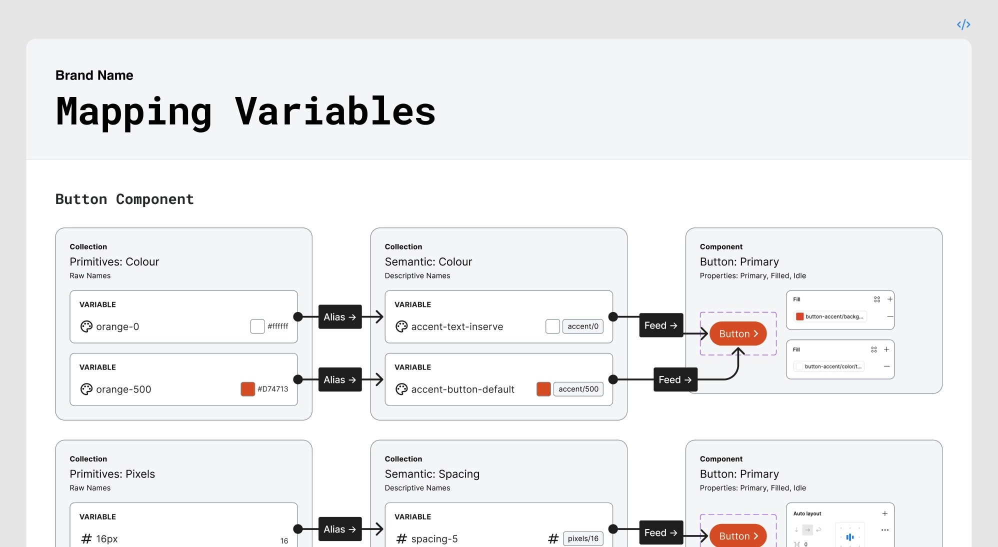
The most important thing I learned wasn't a technique. It was that there is no universal right way to build a design system. The right structure depends entirely on the technology it needs to serve and the purpose it needs to fulfil. For BSO, that meant WordPress and the founder, who has an engineering background, could see the same opportunity I could. If we mapped design primitives correctly, they could be mirrored directly in the codebase. Design decisions would propagate through to development without translation loss.
That alignment was the unlock. This stopped being a personal efficiency project and became a shared infrastructure investment.
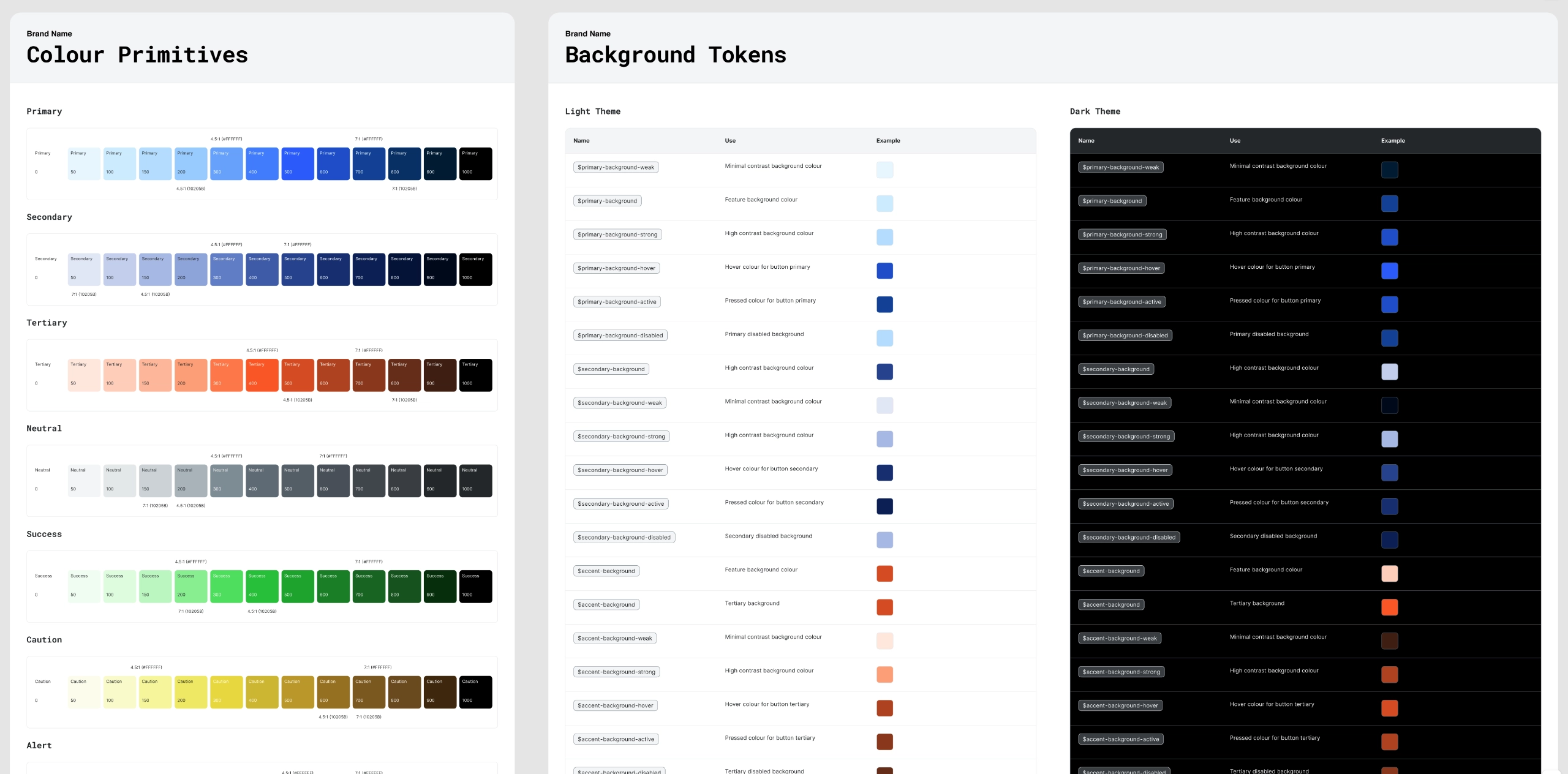
Colour primitive scales built with accessibility contrast ratios embedded — each value is a decision, not a guess.
The system was structured in layers. Raw primitive values the "what" feed into semantic tokens the "where and why" which then feed into components. Changing a primitive cascades through the entire system. Swapping a brand colour for a new client becomes a single update rather than a manual find-and-replace across every file.
Primitive layer: colour scales across seven categories, each with contrast ratios built in. Spacing on a 12-step scale from 2px to 128px. Radius tokens from none to full. Typography at two scales desktop on a 1.25 Major Third ratio, mobile on a 1.20 Minor Third with display, heading, and paragraph levels all defined.
Semantic layer: background tokens, text tokens, and border tokens mapped across light and dark themes. Every token named for its purpose rather than its value, so the system communicates intent to developers, not just appearance.
Layout layer: breakpoints at SM (375), MD (768), LG (1024), and XL (1440), with margin, gutter, and column values defined per breakpoint. Column widths calculated for 2, 3, 4, 6, 8, and 12-column grids across all four screens.
With the foundation in place, components inherit rather than invent. A button doesn't have a hardcoded colour value it references accent-button-default, which references orange-500. To rebrand a client, you change one primitive. Everything updates.
The component library covers the recurring surface area of lead generation and ecommerce builds: buttons across all variants and states, forms including inputs, checkboxes, radio buttons, and field layouts, navigation with header, footer, mega menu, and dropdown patterns, tiles in multiple layout configurations, and pagination.
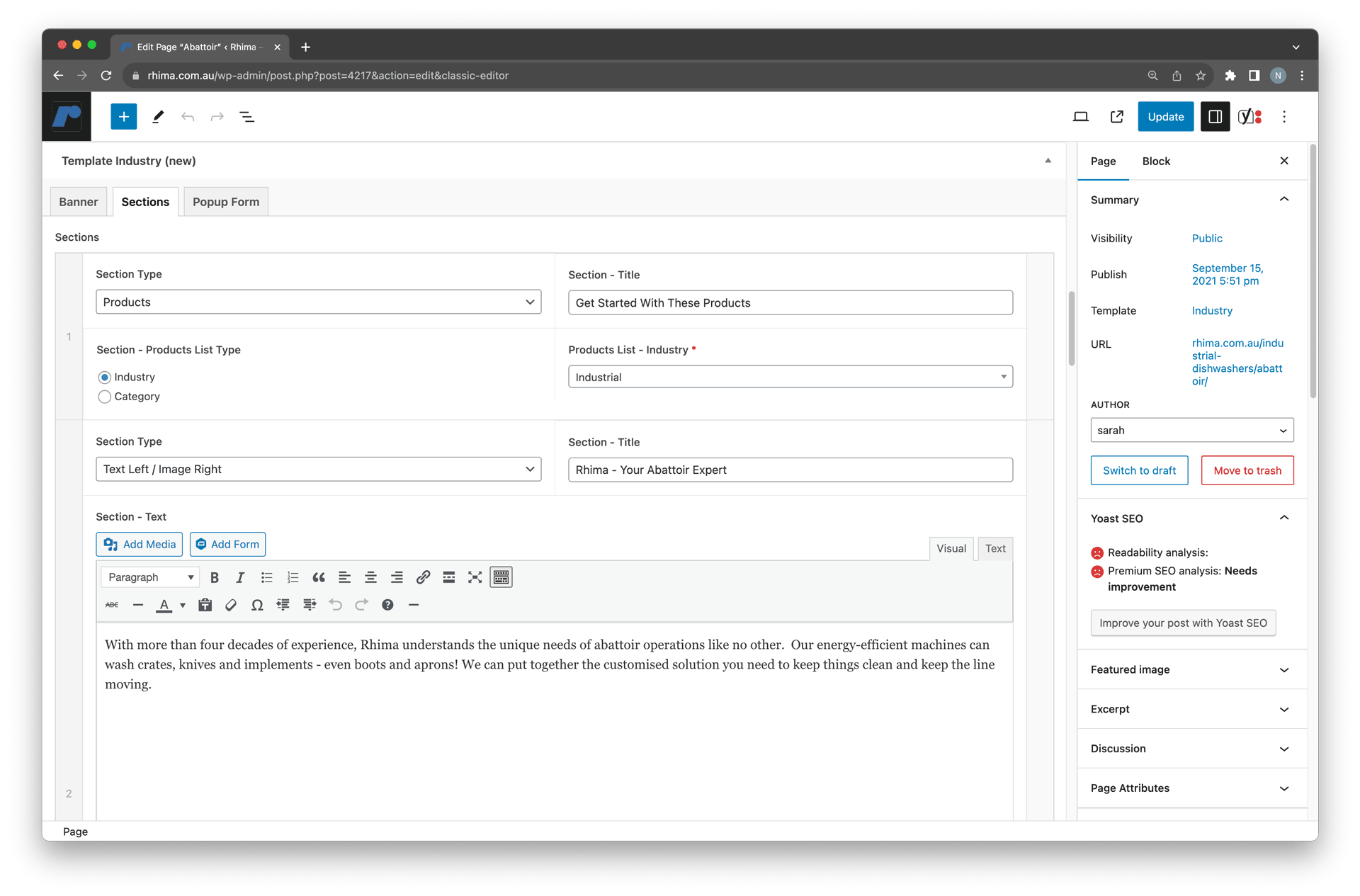
The first real-world test came from an existing client a company running about 25 category pages on their website. The pages were dense with content and struggling to convert. The classic WordPress editor was limiting what was visually achievable, and clients were finding the backend difficult to manage without technical help.
Using the system, I designed a scalable category page template. The front end addressed the core problem: scannability as the primary goal, funnelling users toward purchase or contact. The back end gave the client control a structured, intuitive editing experience that didn't require a developer for routine content updates.
After three months, the average bounce rate across those pages dropped from 81% to 44%.
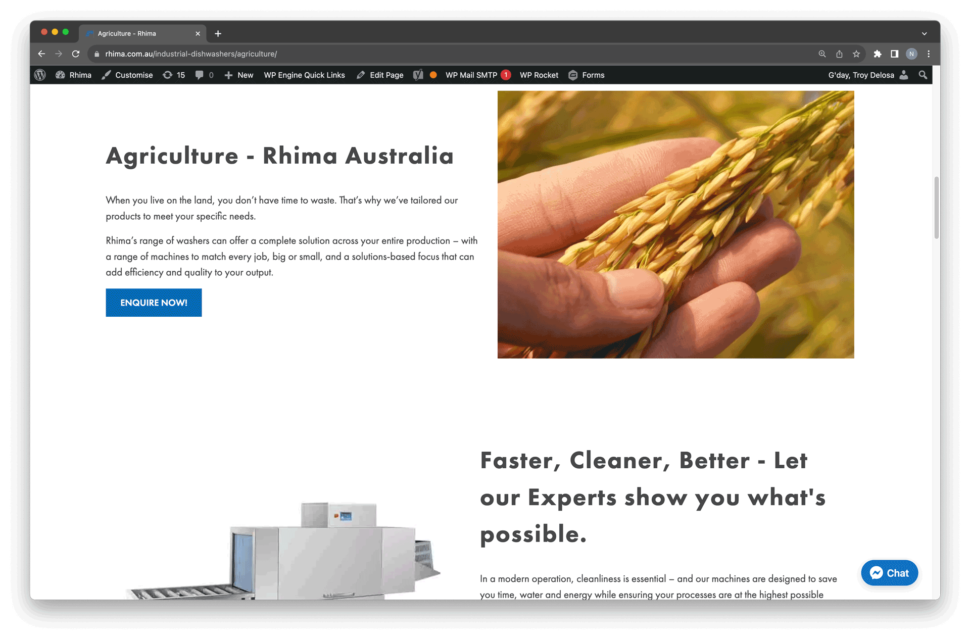
After: scannability-first layout with a client-manageable content structure.
Before: limited visual design and an unstructured backend.
Once a base existed, new projects started differently. Rather than rebuilding from zero, I could adjust primitive properties to match a client's brand and inherit a functioning component library. The two-week build window could focus on customer journeys what the site needed to do for lead generation or ecommerce rather than on reconstructing atoms for the fourth time.
My background in branding and graphic design directly informed how I structured the system. Understanding how visual identity translates into a consistent digital experience how a colour choice becomes a token, how a typographic decision becomes a scale meant the system wasn't just technically correct. It reflected how brands actually communicate.
The founder's involvement meant the primitive mapping extended to the WordPress codebase. Design and development shared a common language, which made handoff more reliable and made client changes easier to scope.
This project started as a personal fix for a practical problem. It became something more durable when the founder saw the same potential I did a shared infrastructure that design and engineering could both build from.
The self-teaching path was unconventional. Months of reading documentation, studying how established systems were structured, starting over when an approach didn't hold up. But learning a system by building one from nothing tends to leave you with a more honest understanding of why it's structured the way it is.
The approach I developed here primitives feeding semantics feeding components, grounded in the technology it needs to serve carried directly into my later work at Computershare, applied at the scale of a regulated, multi-market financial product.