Making banking tasks clear, predictable, and safe for users under financial and regulatory constraints.
I led the development of a scalable banking details solution across multiple user journeys: onboarding, global account setup, and holder account management. This involved defining a clear information architecture and facilitating alignment between product, engineering, and support teams. A key challenge was establishing UX boundaries: determining which validations the system could handle automatically versus which details required explicit user confirmation to ensure accuracy and trust.
Role:
Lead UX Designer
Company:
Computershare
Duration:
2 weeks
“Users must clearly understand what the system can verify vs what they must guarantee. Ambiguity here is harmful.”
To understand the problem space, I partnered closely with a Business Analyst and Solutions Architect during discovery. The goal was to uncover the business logic, technical constraints, and regulatory requirements that would directly shape the user experience.
Through workshops and working sessions, we aligned on:
Customer journey: Login to adding bank details
This phase focused on de-risking the experience by translating complex backend rules into clear, understandable user flows. These insights informed:
This approach ensured the final designs balanced user clarity, technical feasibility, and regulatory compliance.
Customer journey: Login to adding bank details
IX flows: Wireframing banking feature
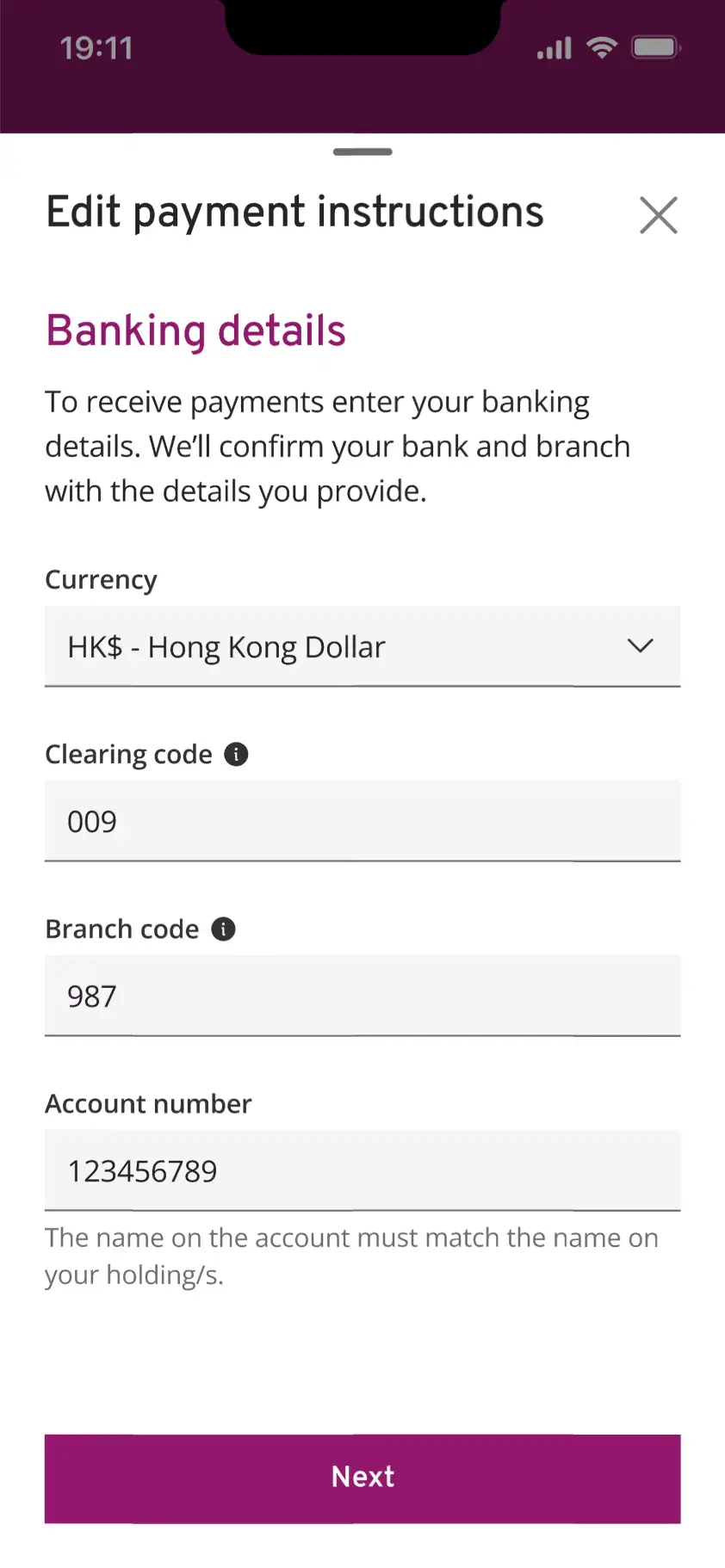
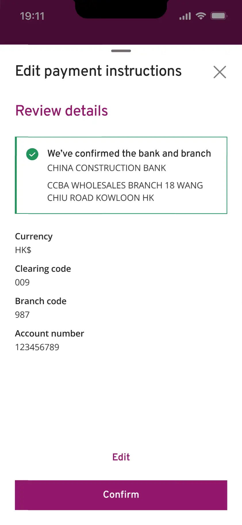
To reduce the risk of irreversible errors, the user is shown confirmation that their bank and branch details were matched in the system.
Executing the idea proved tricky. Design patterns such as modals, inline notifications and toasts all communicate the idea well. However, the pattern has to scale in the context of a multi-step page in onboarding and as a sheet once a user is onboarded. Using an inline notification provided users the most clarity on all journeys.
This pattern balanced safety with momentum, without overloading users with warnings. Lastly, this aligned with financial best practices and reduced downstream support issues.
A key decision was to explicitly separate what the system could validate (bank, branch, currency) from what the user must confirm themselves (account number accuracy and account name alignment).
This reduced ambiguity and helped prevent false assumptions about system validation.
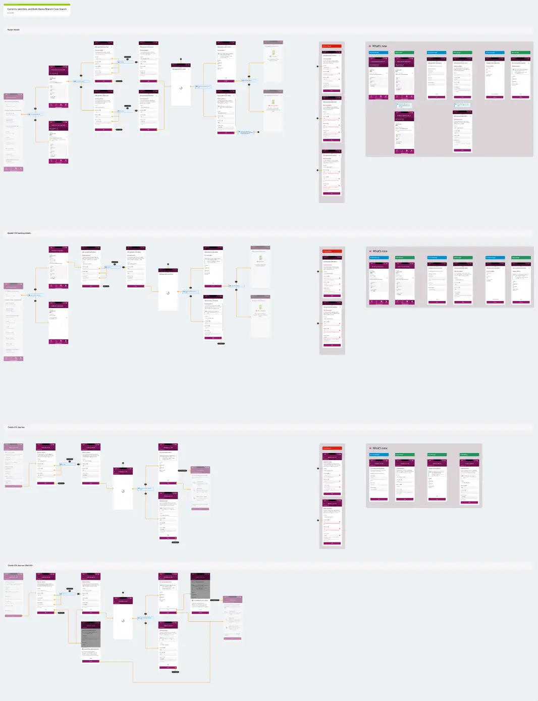
High fidelity Figma handover specs: Full customer journeys
The final experience provided users with a clear, predictable, and trustworthy flow for entering banking details.Key outcomes included:
While quantitative metrics were not available at the time, the solution was well-received by stakeholders and aligned with compliance and engineering expectations.
With future iterations, I would explore usability testing focused on: